Top React Component Libraries for 2025
This guide presents the most significant React component libraries available in 2025, highlighting their core features and use cases.
Leading React UI Libraries
1. Shadcn UI
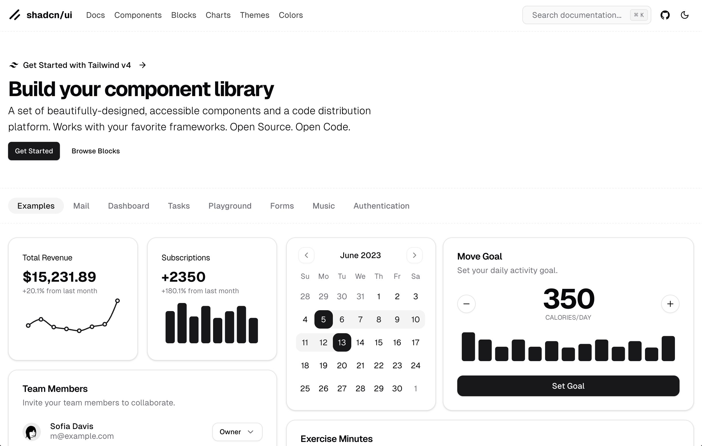
Best for: Design system implementation
Shadcn UI provides a collection of reusable components that you can copy and paste into your applications, giving you complete control over the implementation and styling.
Key features:
- Component-first architecture with no runtime
- Tailwind CSS integration
- Customizable design tokens
- Advanced theming capabilities
- Accessibility compliance
2. Hero UI (Previously Next UI)
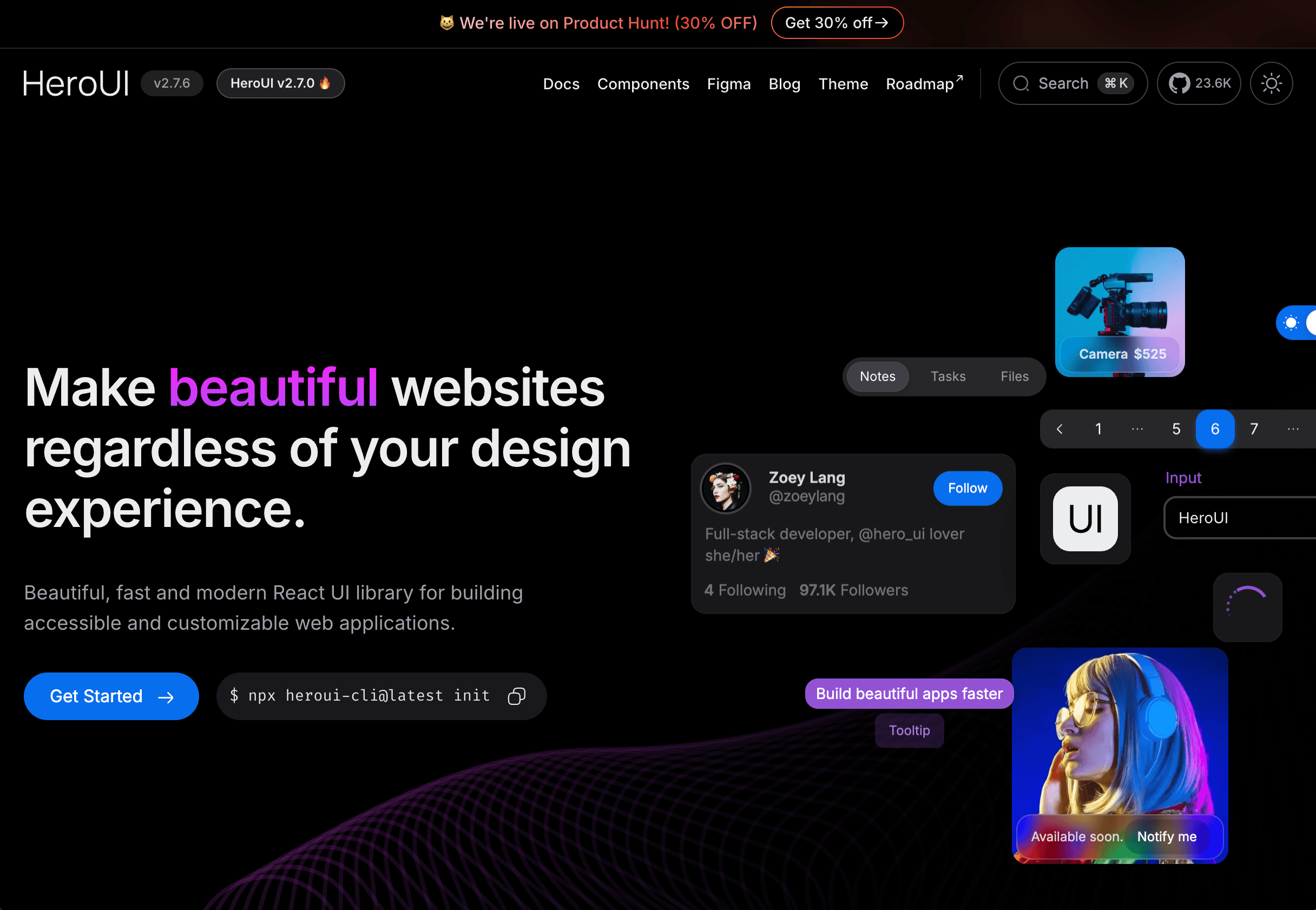
Best for: Next.js applications
Hero UI is specifically optimized for Next.js projects, offering seamless integration with server components and app router architecture.
Key features:
- Server component optimization
- Built-in internationalization
- Adaptive loading strategies
- Accessibility enhancements
- CMS platform integration
3. Mantine
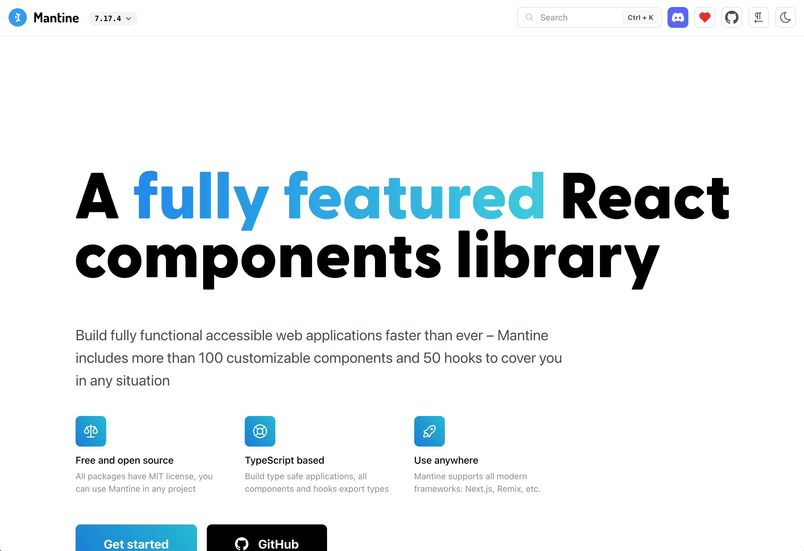
Best for: Rapid application development
Mantine accelerates development with its comprehensive suite of components and hooks, reducing the need for custom implementations of common UI patterns.
Key features:
- Comprehensive hook library
- Advanced theming engine
- Form generation and validation
- Testing utilities
- Extensive component ecosystem
4. Radix UI + Tailwind
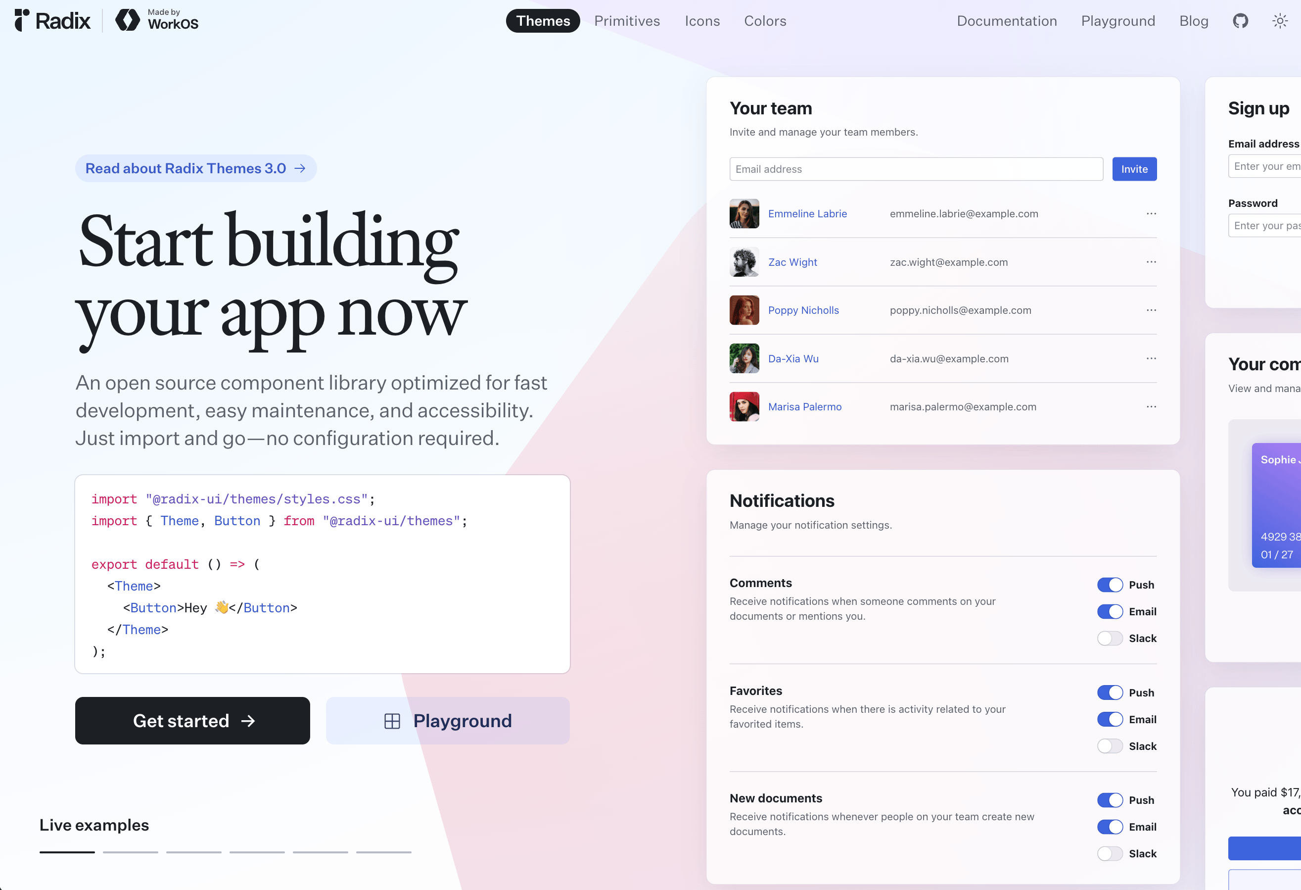
Best for: Custom design implementations
This combination leverages Radix UI's unstyled, accessible components with Tailwind's utility-first CSS approach for maximum design flexibility.
Key features:
- Headless component architecture
- Composition API
- Cross-browser compatibility
- Custom plugin system
- Design system tooling
5. Material UI

Best for: Large-scale applications
Material UI implements Google's Material Design principles in React, offering a mature, battle-tested component library with extensive documentation.
Key features:
- Enterprise-grade component library
- Data visualization components
- Design token system
- State management integration
- Documentation generation
6. Base UI
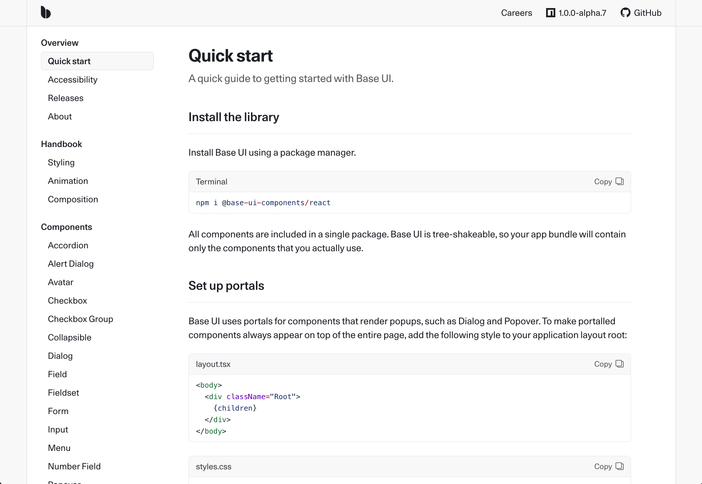
Best for: Design system foundations
Base UI provides the essential building blocks for creating custom design systems without imposing visual opinions or unnecessary complexity.
Key features:
- Minimal unstyled components
- Tree-shakeable architecture
- Flexible styling options
- Portal system for advanced components
- TypeScript integration
Key Considerations for Selection
When selecting a React component library, consider these factors:
- Performance requirements: Bundle size and rendering optimization
- Design flexibility: Customization capabilities and theming
- Accessibility compliance: Built-in accessibility features
- TypeScript support: Type definitions and integration
- Community and maintenance: Active development and community support
Each library offers distinct advantages depending on project requirements, team expertise, and application scale.
Build Your Own Component Library with Layout
Ready to create your own custom component library that perfectly matches your design system? Try Layout, your ultimate tool for building and maintaining beautiful code components.
Layout enables you to:
- Import variables directly from Figma to ensure design consistency
- Create a centralized design system with comprehensive documentation
- Manage colors, typography, and component libraries in one place
- Generate installation instructions for your team
- Track component updates with detailed change history